
Client
Techpay
Service
Brand Identity
The logo of Techpay, concept for a digital payment app, revolves around the theme of seamless and secure financial transactions driven by modern technology.
At the center of the design is a flowing currency paper element, crafted to appear dynamic and fluid, symbolizing the effortless movement of digital money. Surrounding this core shape is a connected technology nodes, representing the smart, secure infrastructure that powers each transaction. Enhancing the idea of transfer dynamics, two arrows are positioned on either side of the design, facing outward in opposite directions. This outward-facing placement suggests movement, exchange, and expansion; highlighting the app’s role in enabling swift, two-way transactions.
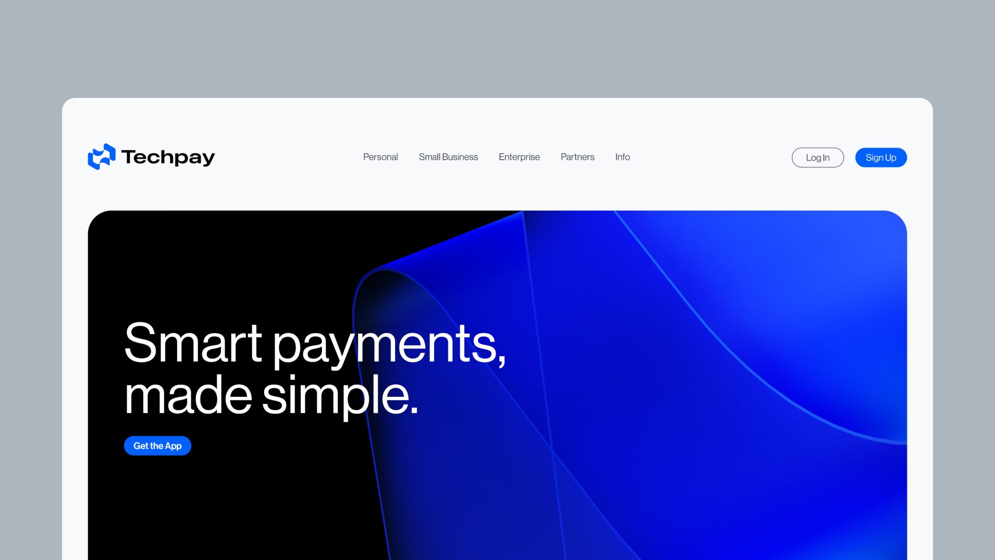
The visual language is clean and futuristic. Altogether, the logo captures Techpay’s essence as a forward-thinking, tech-enabled payment solution.