Client
Zwap
Service
Brand Identity
Zwap is a company that specialize in the export-import business. The Company has a strong focus on delivering packages to their customers on time and has always been punctual and loyal to all their customers as well as employees. Through its export-import portal, the brand has captured new markets for their products and services, and has an expanded reach to a global audience.
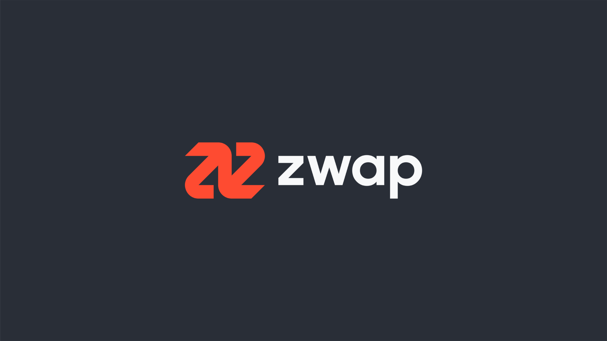

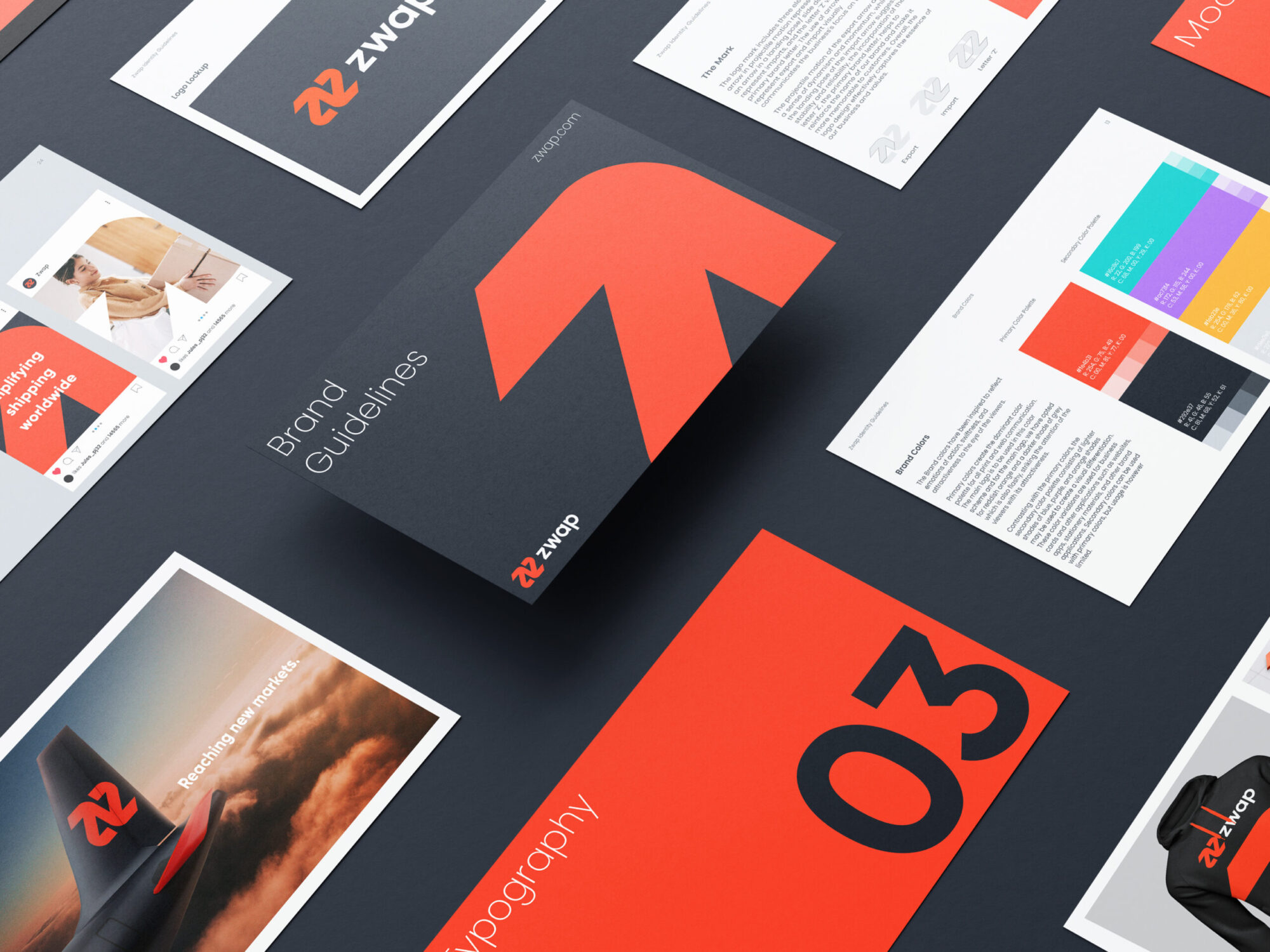
The logo mark includes three elements; an arrow in projectile motion representing export, an arrow in a landing pose/ side downwards to represent imports, and the letter 'Z' which is the primary brand letter. The use of arrows to represent export and import visually communicates the business's focus on trade. The projectile motion of the export arrow adds a sense of dynamism and momentum, while the landing pose of the import arrow suggests stability and reliability. The incorporation of the letter 'Z', the primary brand letter, helps to reinforce the company's name and make it more memorable to customers. Overall, the logo design seems to effectively capture the essence of Zwap's business and values.
